

Hello everyone,
I’d like to know how you like the new look of my blog. I switched the theme so it will read better on various devices. There is still fine-tuning left to do but I will get to it.
Please let me know what you think.
In other news, a little story I wrote is now published within the winter issue of Spotlight On Recovery magazine. The article is titled Salute to Strangers.
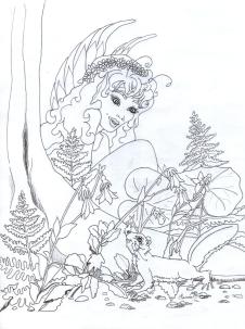
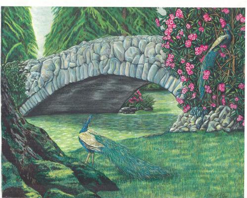
Oh, and the current header image is a mixed media: colored pencil, magic marker, water color, and a smidgen of acrylic. It is the bottom half of a larger work.
Keep in touch!

I agree, the peacock is beautiful. So is the whole artwork.
LikeLiked by 1 person
Thank you so much.
LikeLike
Love the peacock, and what a beautiful piece! As for the new look, having two sidebars is too much for me. Detracts from your gorgeous artwork. I would suggest picking one or the other, so we can focus on your lovely images.
LikeLiked by 1 person
Oh, thank you very much. I didn’t know I had 2 sidebars. I’m still investigating this theme. But I am so backlogged with work it might take me a little while. I appreciate this type of help a lot! Thank you again! I’m listening for other suggestions too so, everyone can pitch in while the gett’n’s good 🙂
LikeLiked by 1 person
Hello Kathryn,
I don’t see 2 sidebars. I only see the one on the right. Could you help me out by helping me to see what you are seeing? Thanks a bunch. 🙂
LikeLiked by 1 person
Sure. In the left side bar I see the title of the post (I think), the date it was posted, and sharing buttons and such. In the right side bar is your search field, Recent Posts, Recent comments, Archives, Categories, etc.
The post itself is between these two bars.
I’m viewing on a PC. Don’t know if it shows up differently on a tablet or phone.
LikeLiked by 1 person
Hmm. I have a PC too and there is only the bar on the right with everything. Now, that’s weird. I might have to go into gidgits or whatever it’s called widgits maybe, to make sure it looks the same for all PC’s, at least. Thank you for letting me know.
LikeLiked by 1 person
Sorry. I didn’t realize I was seeing it only on posts.
LikeLiked by 1 person
That’s alright. I’m unsure if I can change that or not. I didn’t see w here I can on the first once-over.
LikeLiked by 1 person
I took a look at your theme. According to the specs, you have only two widget areas, the right sidebar and the footer. So what I thought was a left sidebar is actually part of the design. My mistake! I apologize. Also, that look has grown on me. Liking it more now. : )
LikeLiked by 1 person
Whew! I thought I was a goner. I wasn’t seeing how I could . . . well . . . I somehow feel so not alone now 🙂 Thank you so much for checking things over I was kinda going nuts 🙂
LikeLike
I peeked over at your blogs. Nice stuff happening there! I followed you but I couldn’t comment there. It was all RSS feed stuff, I think. Alien to me 🙂
LikeLike
Oh, I see it now! It shows up on every page but the home page. Okay. So I’m making progress here. 🙂
LikeLiked by 1 person
Hooray!
LikeLiked by 1 person
I love this image. You did it? Very creative! And beautiful. Wish I knew how to do that.
LikeLike
Thank you so much. I’ll be giving art classes locally starting in March. I could teach you 🙂 I don’t know how I could get those sort of lessons up on line but I know others people do. I’m hoping to have some time in Feb. to learn some things in those regards.
LikeLiked by 1 person
That would be great, if it could be done online. I would love to learn.
LikeLiked by 1 person
Well, never say never, but I have a lot of learning to do. 🙂
LikeLiked by 1 person
Say, I tried replying to your comment about following my blogs, (Thank you!), but it wouldn’t take. Probably reached the thread limit. On my posts, you should see a comment field above the solid black line and Meta/RSS info. It will be below the posts, after the share buttons and “related posts.” If you don’t see one let me know, because, yikes!
LikeLiked by 1 person
I did see it and clicked it but maybe you don’t have it “turned on.” Check and see.
LikeLike
I love it! It really shows off your art.
LikeLiked by 1 person
Thank you.
LikeLiked by 1 person
Haven’t been by in a while. Too long. I like the look. I think it reflects your artistry better in the flow and feel of the “page”. It’s relaxed and comfortable. Comforting. Nice choice, well done 🙂
LikeLike
Thank you. I haven’t been by in a while either. Going through some things here. I appreciate your visit and feedback a lot.
LikeLike